Over the years, we’ve spent a lot of time helping arts and culture organisations think about how they present themselves. More recently, it’s felt like the right time to ask the same of ourselves.
How we got here
Our new brand comes following a change in how we now think about HDK. Around the time we turned 20, not long after the pandemic, we recognised that we’d matured.
HDK started as a consultancy in the earliest days of digital marketing. Over time, we built out into a full agency, growing a team with real depth in arts and culture and a portfolio of projects under our belt. We’ve learned how we work; who we work best with; and where we can add the most value. And all of this done alongside some brilliant, creative, mission-led organisations, who spark our imagination every day.
We wanted to distill all of this into a new brand that would not only reflect how we’d changed as an agency, but could also take us into the future. Something that would make us feel comfortable in our own skin while driving us forward to meet new challenges.
So we went beyond visual identity. The team dug into our values: what we believe about accessibility and sustainability, what our B Corp accreditation means in practice, how we actually work with clients, and why this sector matters to us. As Hans, Director, says: ‘This rebrand is less about becoming something new, and more about getting clearer on who we already are.’
For Raf, Creative Director, ‘HDK has changed a lot over the last few years, but the thing that has always driven me, and I think the whole team, is the closeness with our clients. Talking to them, getting to know them, understanding what they’re really after. It never feels like a transaction and we never want it to. The rebrand felt like a natural moment to reflect all of that.’
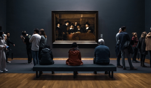
Photo by Ahmet Kurt on Unsplash
Artfully Digital
The starting point was to better articulate what we do, and why. In particular, we wanted to explore the combination of both creativity and technology, and communicate this in a simple way.
Artfully Digital came out of those initial conversations. It gave us a clear way to express the duality of our work, and it felt true to how the team operates. It was recognising and naming how we had naturally evolved, rather than inventing something new.
The process was collaborative, bringing in perspectives from across the team to test whether it resonated, and refining it until it felt both distinctive and honest.
As Zoe, our Head of Client Services, explains: ‘We work with arts and cultural organisations where the stakes are as emotional as they are commercial. ‘Artfully’ speaks to that sensitivity, that understanding of audience, story and experience. ‘Digital’ grounds us in the craft, the systems, the delivery. It’s the balance we’ve always aimed for.’
A new look
When you’re deep in the everyday, the challenge isn’t knowing who you are. It’s finding the right way to show it. And we’ve always believed the best work comes out of genuine collaboration: with our team, with clients, with the wider sector.
So although we’re a creative agency, bringing in an external perspective for the visual identity felt like a natural next step. We’d already worked closely with EDIT, who had worked on the new branding for English National Ballet, and collaborating on that website project gave us a real feel for how they think. When it came to our own identity, the choice was clear.
As Raf says, ‘We do this work every day for our clients, and we know better than anyone how much an outside eye can unlock. When EDIT agreed to take us on, there was a genuine sense of excitement. The new identity that we settled on is bold, clear and, most importantly, honest.’
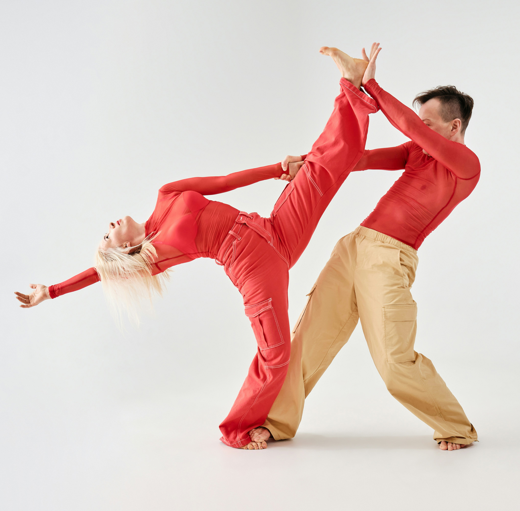
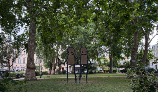
Photo by Andrej Lišakov on Unsplash
Conversations & collaboration
If the brand was going to reflect the team, the team needed to shape it. It truly became a full-team project, starting with early conversations around our positioning and identity.
Zoe explains, ‘The process itself was intentionally collaborative. It started with defining the core positioning, then bringing the team in to sense-check, challenge and shape it. From there, it moved into brand values, voice, messaging, and identity, making sure everything consistently reflected that central idea. A key focus throughout was making sure it felt like us.’
For Fizz, Digital Marketing, ‘Working with the wider team to define what we do and don’t like before sending off our initial thoughts to EDIT was a really enjoyable part of the process. It could be challenging at times: unsurprisingly, a group of people will have very different opinions on what works visually. But we always managed to find the overlaps and shape something that felt cohesive. I loved the range of creative directions they developed, all rooted in our brand values.’
We started working on our new website at the same time as our visual identity, which helped us ask the right questions from the start: like what are we trying to achieve, what are we saying, and why?
With a new website on the horizon, we were able to bring our cross-team skillset together across project management, marketing, design, and web development. As a B Corp agency, we made sure each choice, from brand font to image resolution, reflected our commitment to sustainability.
When we came to the digital application of the visual identity, Raf says, ‘What that involves is getting under the skin of the brand and understanding what it’s really saying, so that when you translate it into a digital context it still feels like the same thing. A website, for example, has its own logic: it moves, it responds, it has to work for a lot of different people in a lot of different situations. The new site is cleaner, easier to use, and built to grow with us. Most importantly, it communicates who we are in a way that is authentic to HDK.’
Where we go from here
Over the last two decades, digital marketing has evolved and adapted at every corner, and the coming years will be no different. Audiences are navigating new habits. Organisations are under real pressure. AI has made an immediate impact on our sector, and digital leadership is more and more front of mind for many organisations.
This rebrand is just one part of how we meet that moment, on the same journey as our clients, partners and collaborators across the sector. We’re curious about what comes next.
Raf says, ‘We know who we are and what we’re good at: what has changed, is that now when someone encounters HDK for the first time, we hope they can feel that too.’
What this rebrand represents, for us, is a clearer foundation and an honest expression of the HDK that’s been building for over 20 years. Culturally grounded. Curious by nature. Collaborative by design. Future focused.
We’re always up for a good conversation. Get in touch.
 Bella RichardsDigital Marketing